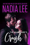
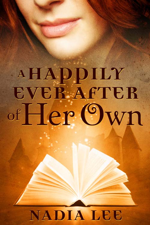
 When I decided to offer A Happily Ever After of Her Own as a free serial, I wanted to make a cute little cover graphic for my website. The only problem? I'm not the best designer in the world. So it had to be outsourced.
I'd gone through the book cover process once with an epublisher. The publisher asked me to fill out a fairly detailed cover art sheet and hired a cover artist. A few weeks later, I got several mock-ups, and I returned them all with feedback. My editor and I went back and forth on the cover mock-ups several times — I think we spent about a week doing this — and I forgot all about it until May told me she had seen my cover on the publisher's website. That surprised me; I hadn't gotten any cover jpg files from the publisher to use on my alter ego Angelle Trieste‘s site to promote the book.
But that wasn't the only surprise. The final cover on the publisher's website looked very different from the mock-ups. The final version featured a new model and his hair color was wrong. (The hair color, etc. on the mock-ups were all correct.) The publisher fixed the color when I told them. The only explanation I got as to why the final was altered without any notification to me or my editor was that the publisher had the last say on the cover. (And since I never got the cover jpg from anyone there, I just took it from the publisher's website to use.)
So now you see how the cover process works at an epublisher. Authors can offer input, but ultimately it's up to the publishers to make the final decision.
For an individual author hiring a cover artist directly, it's a little bit different. First of all, I had to decide who to hire. I had a budget I didn't want to exceed, but at the same time I didn't want a crappy cover either. I put some feelers out there at places like Romance Divas, etc. Several people gave me advice and referred me to a bunch of sites with cover portfolios.
Initially, I was going to ask Frauke from CrocoDesigns (FYI — she designed my website, and I knew she'd do a good job), but she was too busy. So I asked other cover artists for quotes and contacted Agent to see if she could refer me to a designer. She called Tara O'Shea and told her what I needed, and Tara emailed me with a quote and turn-around time.
One week. W00t!
Besides, I've seen Tara's portfolio, and I thought she was best suited for what I needed. So I asked her for three items before hiring her:
- an invoice at the end of the project (for tax reasons)
- the cover graphics in jpg & Photoshop format
- all stock photos used for the cover
I also made sure it was a work-for-hire and that I could use the the final product freely. This is especially important for legal reasons; I don't want to have to ask for permission every time I want to do something with the cover.
 Tara's response was exactly what I was hoping for, so I asked her to go ahead. That meant it was her turn to shoot me questions. She asked me what I wanted. I gave her a link to a stock photo site and said, “This is kinda similar to what I have in mind.” (The picture on the right is the one I sent Tara.) I also emailed her the story blurb and entire manuscript in .doc format. I was pretty vague about what I wanted though. The following summarizes my wish list:
- It's a paranormal romance novella and fairly light in tone.
- It should look romantic but no clinch since it's PG.
- I'd love to see your ideas / vision.
Then I waited one week.
On Thursday October 1, I'll talk about the cover mock-ups and the final decision process. :)
Feel free to leave me questions and/or comments. I'll answer them here or if they require a long answer, I'll turn it into a post. :)
PSA: The first two chapters are free, but the rest are available to newsletter subscribers only. Sign up now.





 Tara's response was exactly what I was hoping for, so I asked her to go ahead. That meant it was her turn to shoot me questions. She asked me what I wanted. I gave her a link to a stock photo site and said, “This is kinda similar to what I have in mind.” (The picture on the right is the one I sent Tara.) I also emailed her the story blurb and entire manuscript in .doc format. I was pretty vague about what I wanted though. The following summarizes my wish list:

