1
| Oct 2009 |
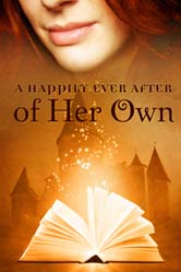
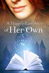
So…after giving Tara O'Shea what I wanted, I waited one week before she sent me three mock-ups. She didn't get a chance to read the entire novella, but scanned it to get the heroine coloring, etc. right. :) So here are the initial mock-ups.
 |
 |
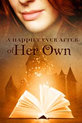 |
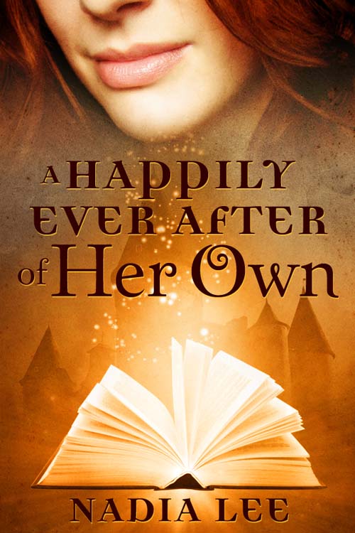
I liked the overall design. It was as though Tara read my mind and knew exactly what I wanted even though I didn't articulate my ideas very well to her. (The mark of a good artist.) However, I thought the title font should be changed since I have to reduce the cover graphic to 133×200 pixels for my blog sidebar. When the cover's that small, you can't see “A Happily Ever After” very well. And we needed to put my name on the cover too. :)
I asked several people what they thought, and at the end, I decided to go with the third picture. I sent an email with the things I wanted changed, and Tara sent me another version. Very close, but I wanted my name to be bolded and slightly bigger because it looked like a long brown smudge when I make the cover picture very small to put on the blog sidebar.
“No problem,” she said. It was done in less than half an hour. (Remember we were doing everything via email.) Being an uber-satisfied customer, I asked her to send me the invoice and all the relevant files. I checked to make sure I got everything and sent Tara her payment.
Though she didn't have to, Tara sent me four different versions of cover jpg file: one large, one medium, one thumbnail and one without any lettering on it (just the picture). Then she sent me the Photoshop file and all the stock photos.
 |
 |
 |
(I've uploaded watermarked pictures to prevent piracy. She didn't send me watermarked files.)
Isn't it amazing what she came up with those pictures? I'm still astounded because she took my initial vague concept to the gorgeous cover.
Feel free to leave me questions and/or comments. I'll answer them here or if they require a long answer, I'll turn it into a post. :)
Don't forget, the serial starts on Monday October 5. :)
PSA: The first two chapters are free, but the rest are available to newsletter subscribers only. Sign up now.









October 1st, 2009 at 11:45 am · Link
You mean, “serialized novella”, don’t you…?
:twisted:
October 1st, 2009 at 12:00 pm · Link
It’s so neat to see this whole process broken down! :) And the cover is lovely Nadia.
October 1st, 2009 at 12:41 pm · Link
The cover is great. It reflects your title perfectly with an emphasis on your heroine and her journey to HEA.
Thanks for sharing the creative journey with us. Not only is your process interesting to read, it is an encouragement to others to see what can be achieved through creative endeavors.
October 2nd, 2009 at 12:28 am · Link
Hero Material — HAHA!
Isabelle — Thank you! :)
Mandy — Thanks! It’s really the work of uber-talented Tara. I really recommend her highly to everyone.
July 8th, 2011 at 8:53 pm · Link
I LOVE it Nadia! It looks magical and so beautiful! Enjoyed reading about the creative process and yes, the end result is gorgeous! Congrats! :p
July 8th, 2011 at 9:09 pm · Link
@Stella (Ex Libris): Thank you, Stella! :)